Nakajima Painting Ltd.

I worked on the website and logo design for Nakajima Painting Ltd., a company based in Ozoracho, Abashiri District, Hokkaido, that operates in the Okhotsk region. The goal was to create a website and logo that reflect the company's business and local identity, with a friendly and visually impactful design.
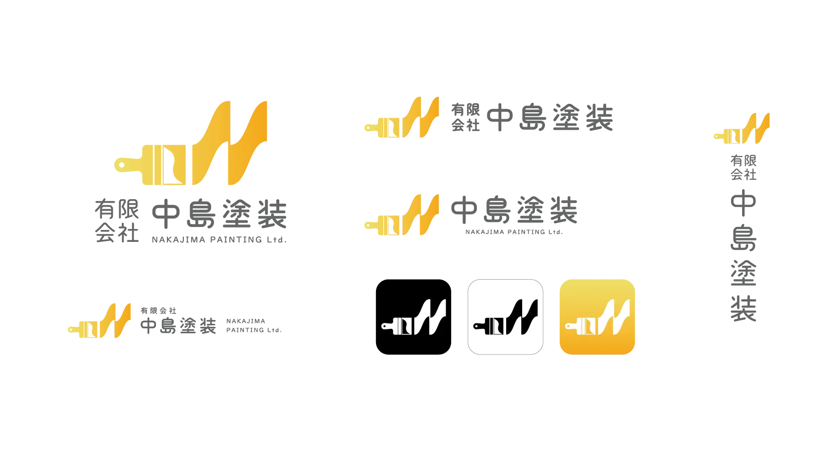
The logo design uses the company’s colors, yellow and orange, as accents to create a simple and clean impression. These colors provide warmth and a sense of trust, making the design feel friendly and approachable. To subtly represent the painting business, I added wavy lines in the background, which suggest paint and connect to the company's work. These small details help emphasize the connection to the painting industry.
Additionally, to achieve a friendly look, I rounded the fonts, buttons, and images, giving the design a soft and warm feel. This creates a sense of unity throughout the design, making it not only visually appealing but also easy to use and welcoming.
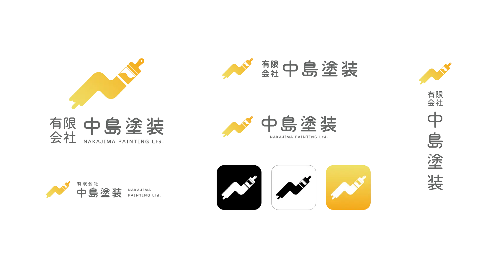
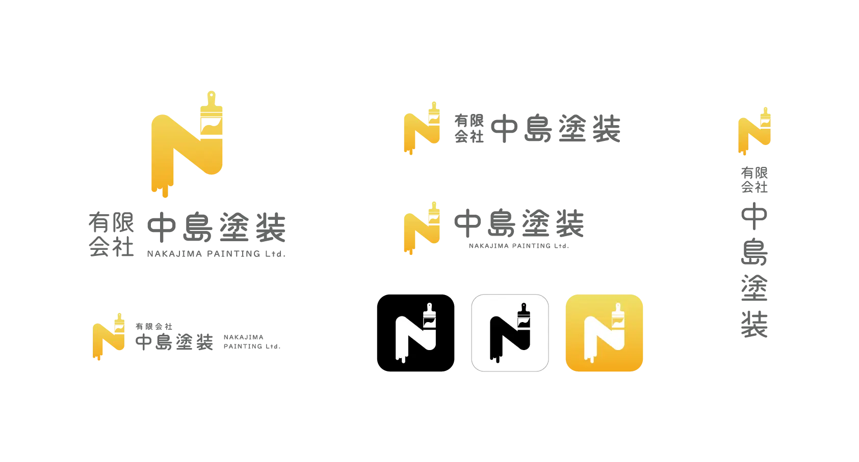
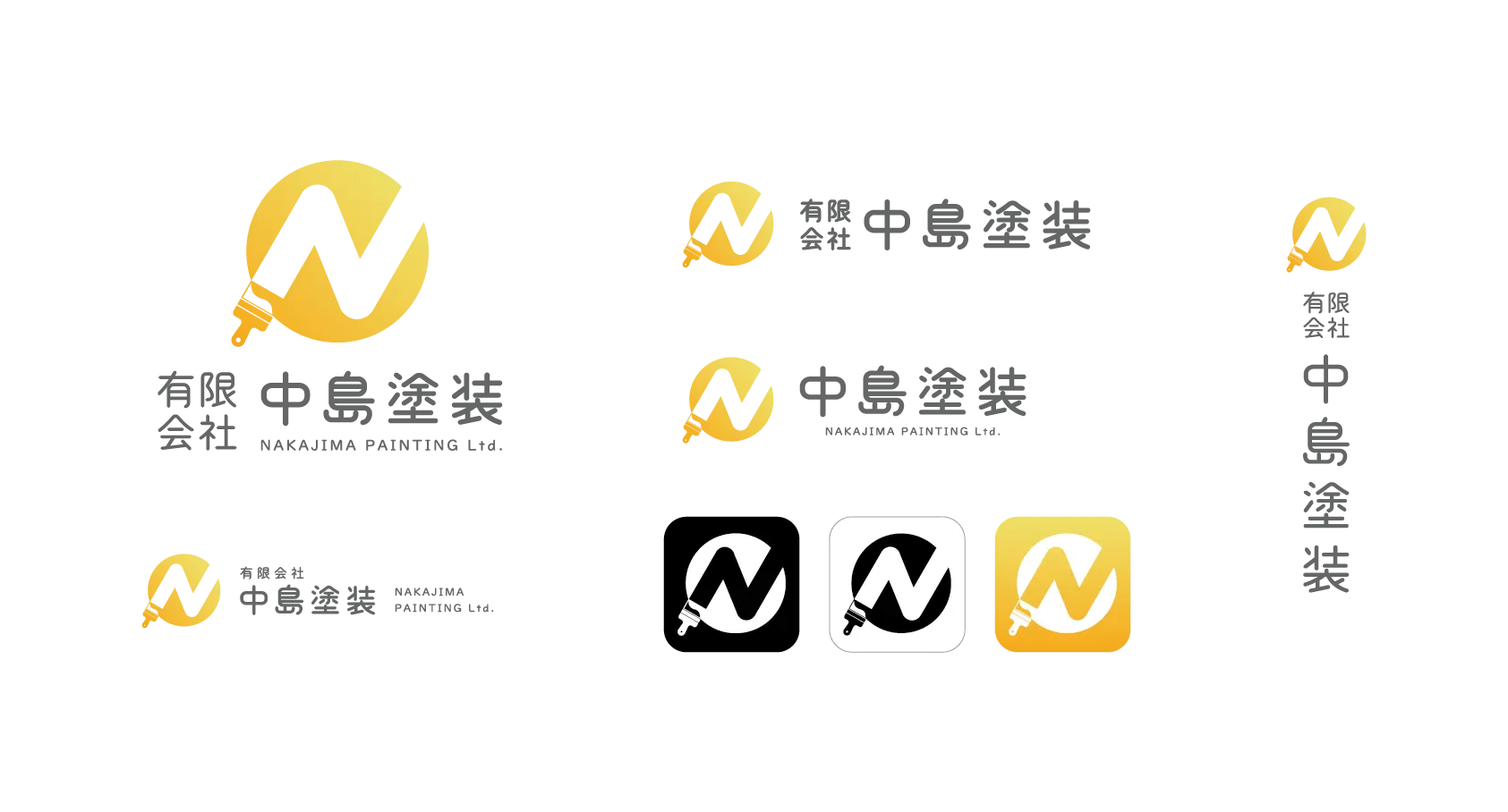
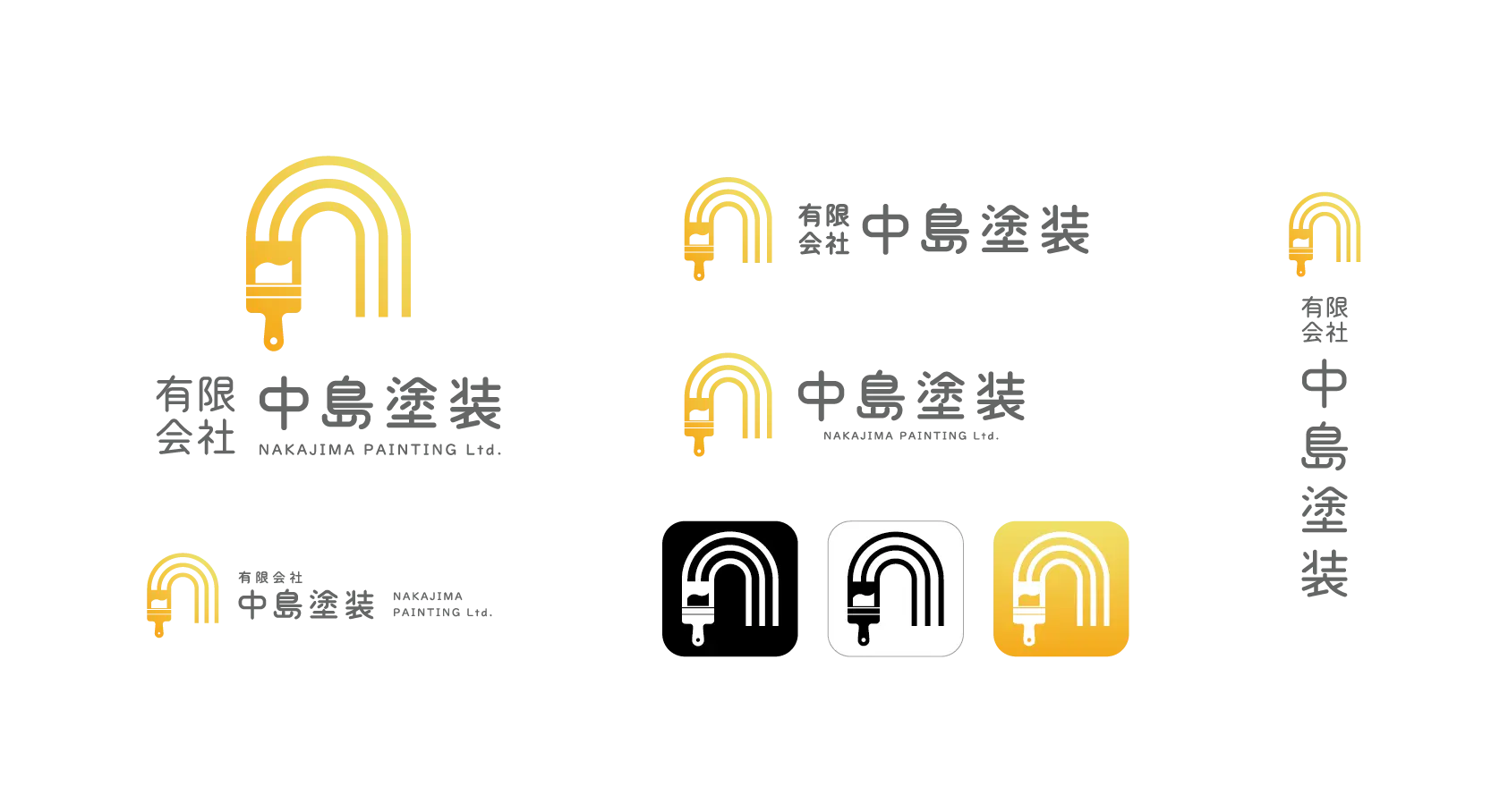
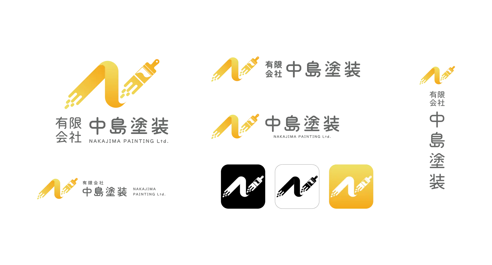
For the logo, I combined the paintbrush, a well-known symbol in the painting industry, with the letter "N" from the company name, "Nakajima Painting," creating a simple yet iconic logo. Using a gradient of yellow and orange expresses the company's long history and tradition while giving it a modern, friendly, and fresh vibe. This logo conveys a sense of trust that has been passed down through generations, while also feeling ready for future growth.
Overall, this design effectively communicates the company’s brand image, giving a warm and trustworthy impression as a local business.
Color

Font

Logo

Artwork

- DATE
- 2023
- CLIENT
- Nakajima Painting Ltd.
- TAGS
- Web Design / Graphic Design
