Sam-ge-tang(Tan)
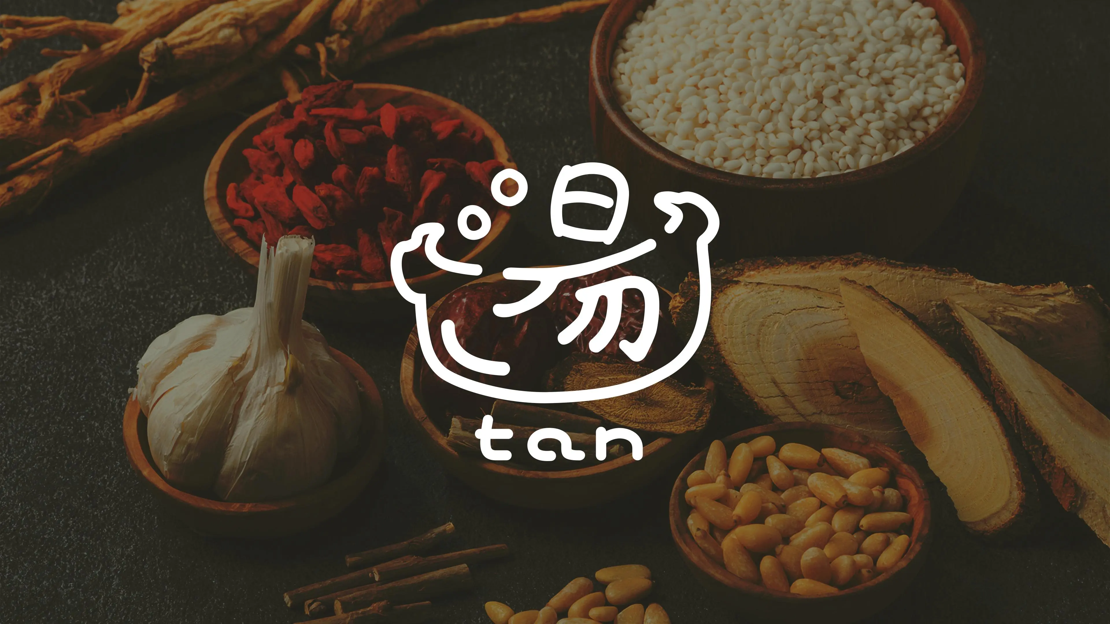
I was responsible for creating the website and promotional materials for Sam-ge-tang(Tan), a Korean restaurant in Uchikanda, Chiyoda, Tokyo. Specializing in authentic Korean cuisine, Sam-ge-tang(Tan) emphasizes traditional cooking methods and organic, natural ingredients. My goal was to create a design that reflects these values, delivering a simple and sophisticated brand image.
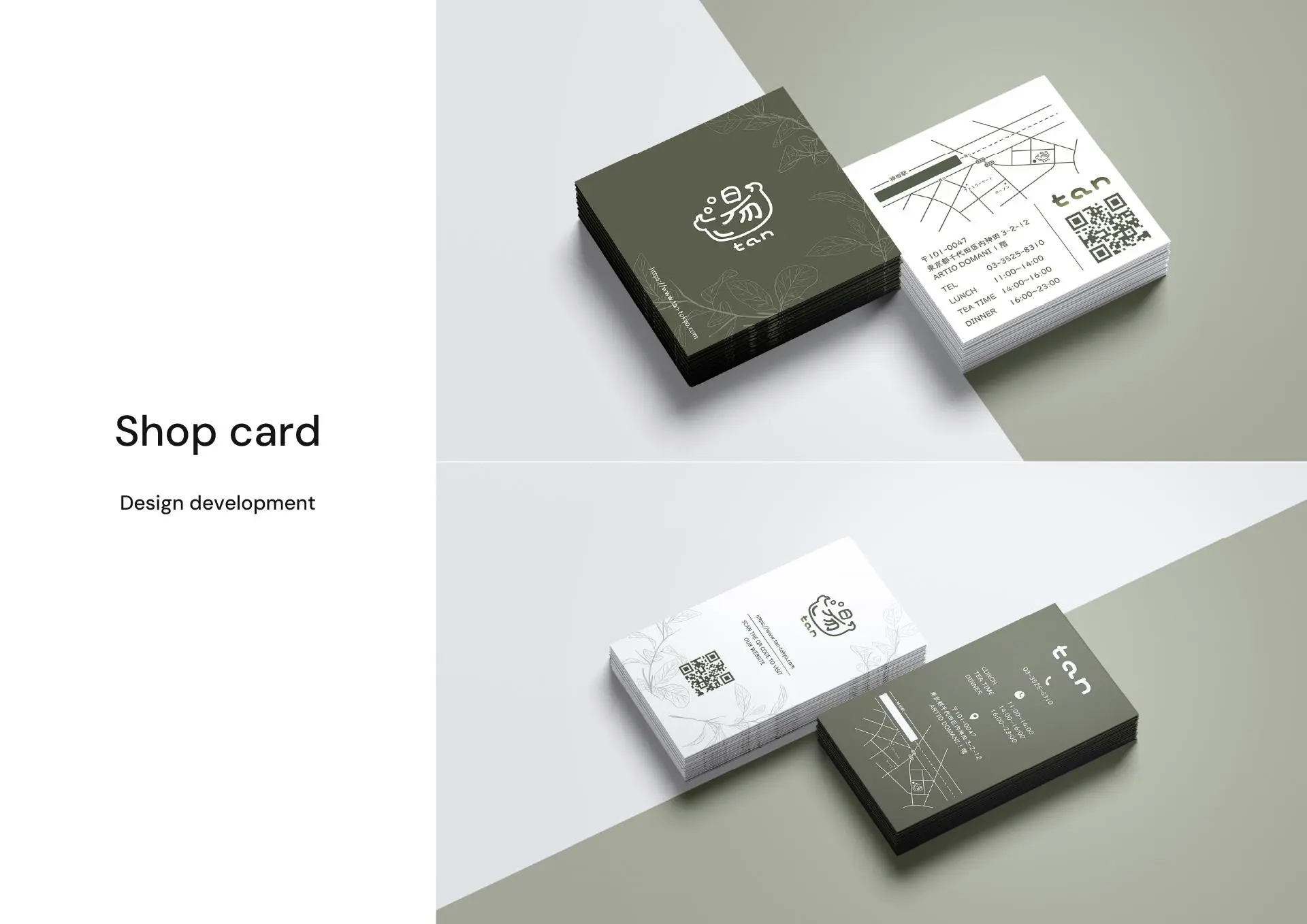
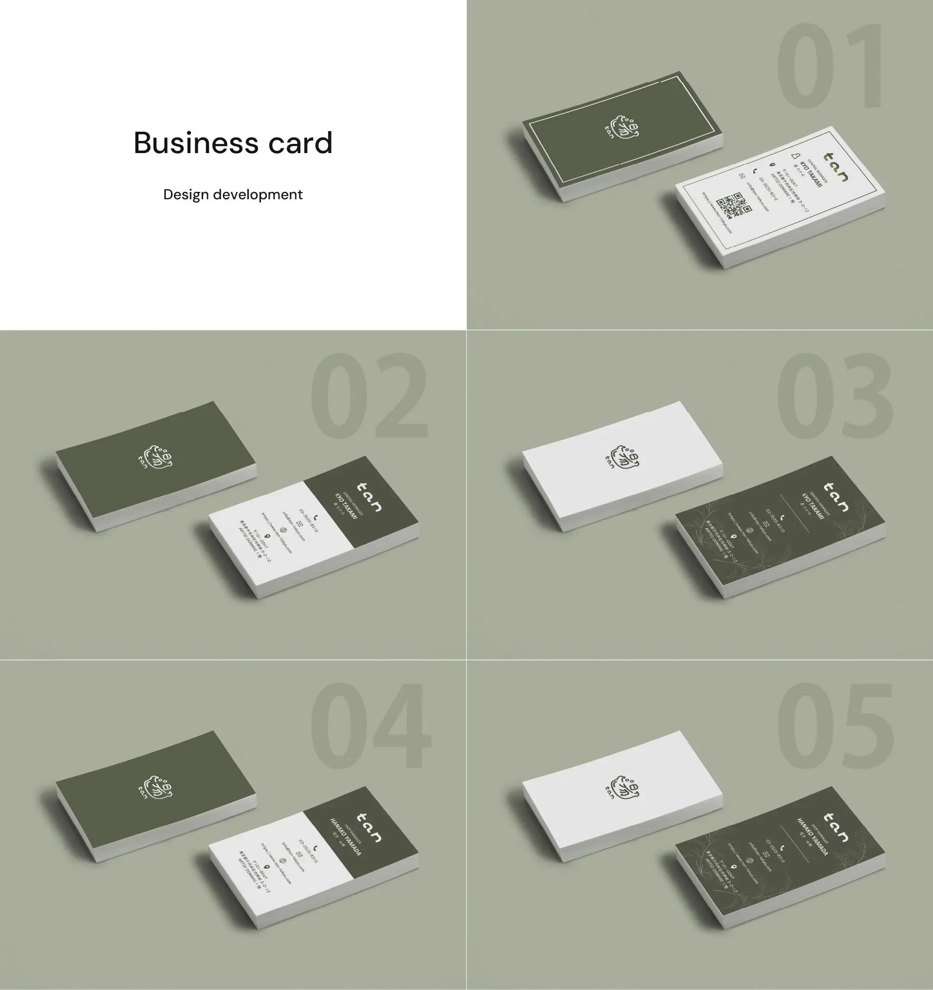
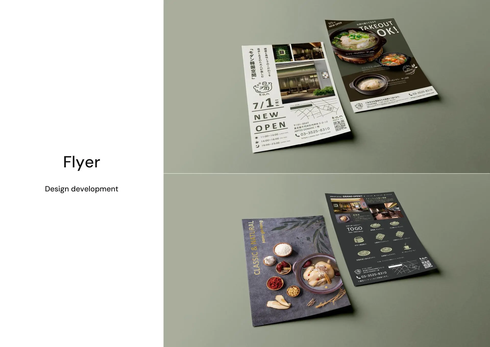
For the promotional materials, I focused on the keywords "Organic & Natural" and "Stylish." To highlight the quality of the ingredients, I kept the design minimal, using only essential elements and eliminating unnecessary colors. This approach creates a clean yet impactful impression, aligning with the restaurant’s commitment to quality and authenticity.
The logo and text sizes were carefully balanced to maintain a natural, understated elegance. This gives the materials a refined and premium look that complements the brand’s style without being too bold or overwhelming.
Color

Font

Logo

Artwork
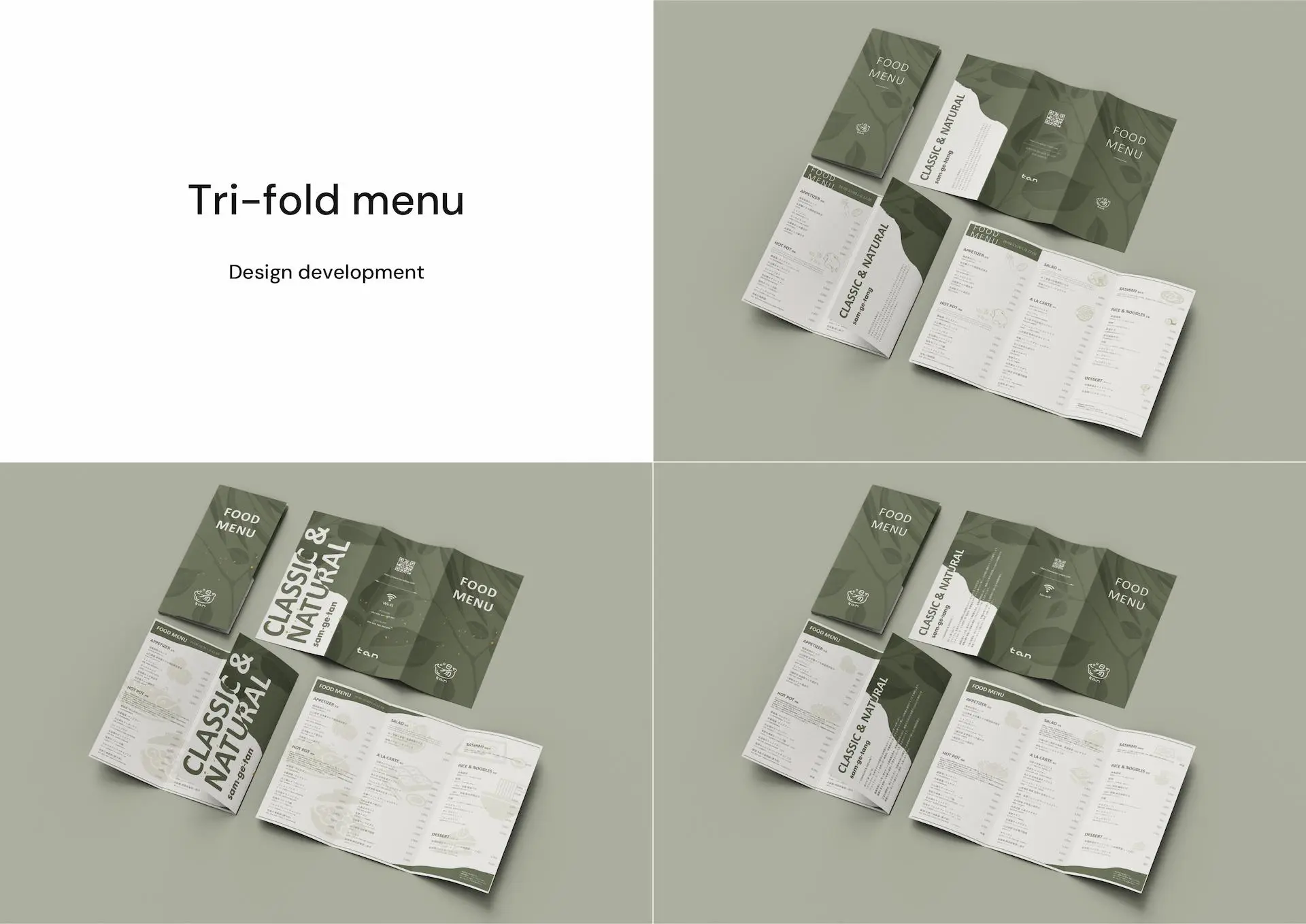
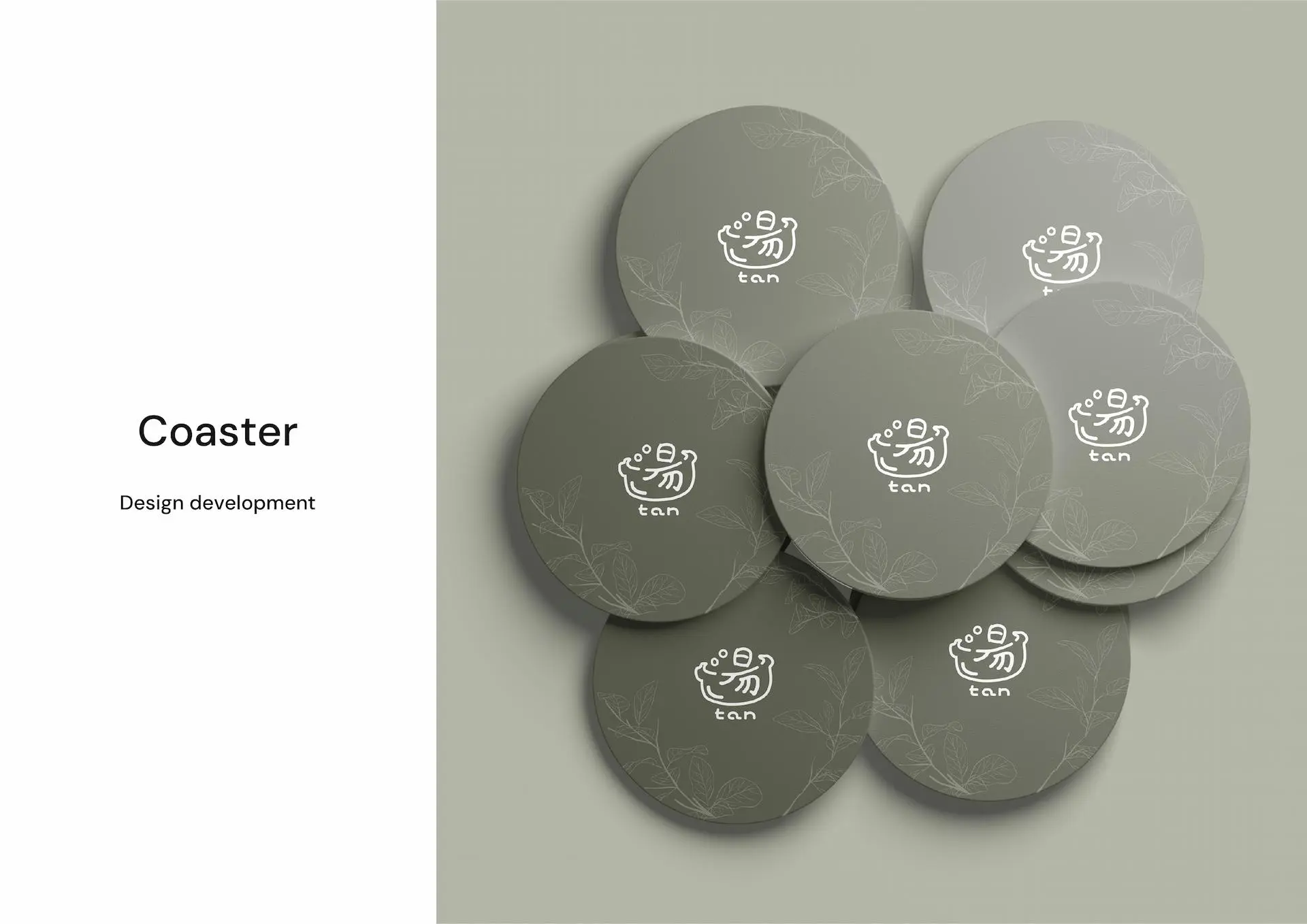

For the website, I aimed to create a unified brand experience by drawing inspiration from both the promotional materials and the restaurant’s modern interior. The site combines simplicity with functionality, providing an inviting and user-friendly online experience that reflects the warmth and quality of the restaurant itself.

