HK ONE Co., Ltd.
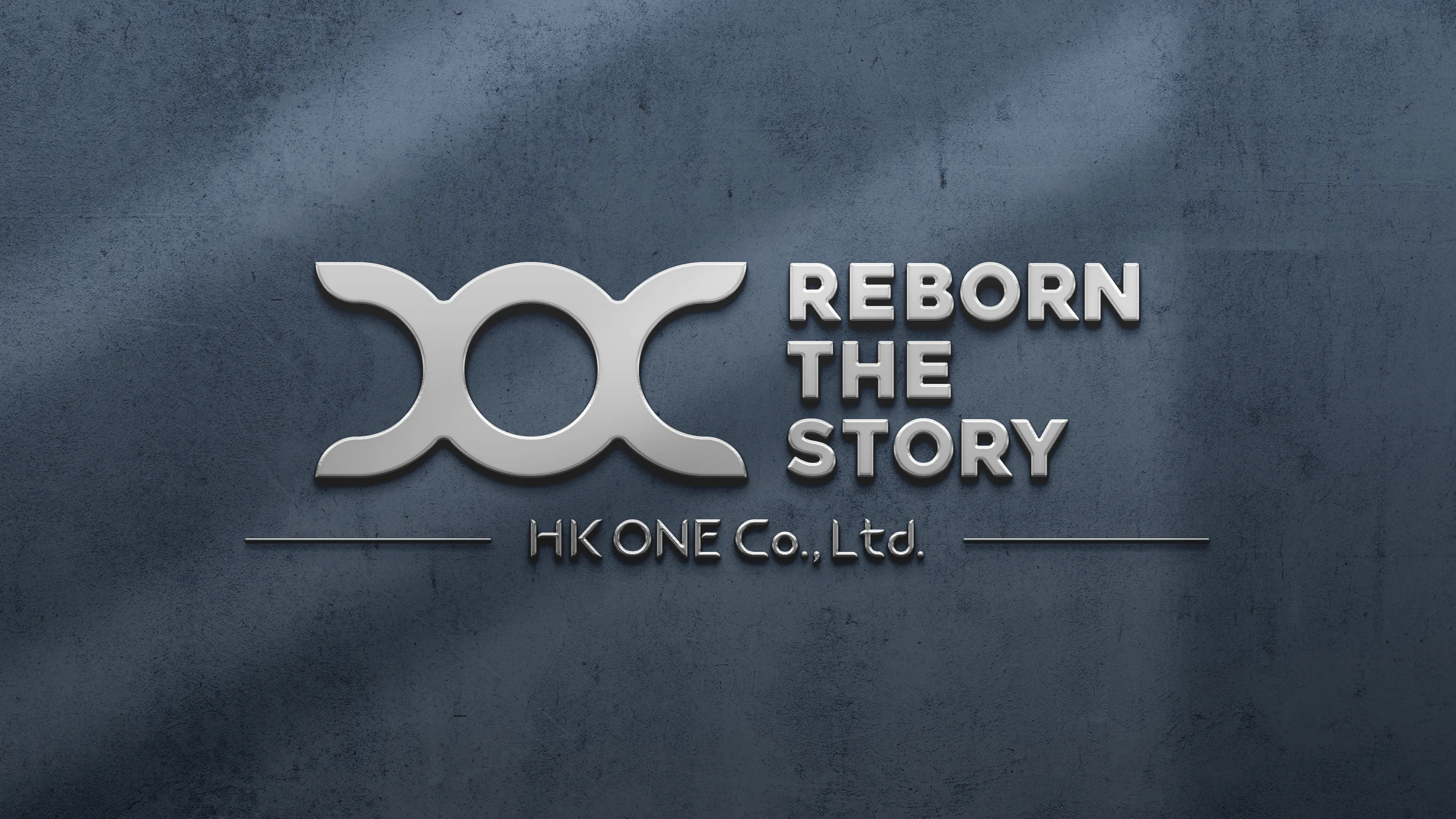
I was responsible for designing the logo for HK ONE Co., Ltd., a company based in Sakai City, Osaka, that specializes in waterproofing, painting, and other construction services for various types of buildings. The goal was to create a modern, meaningful logo that reflected the company's expertise while incorporating the desired elements.
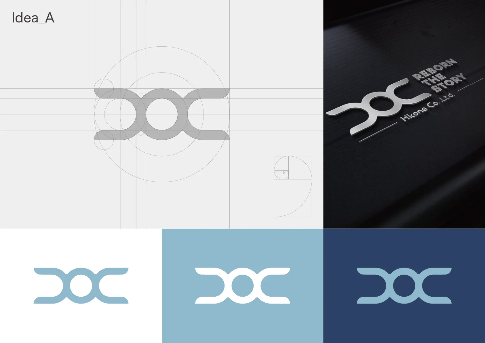
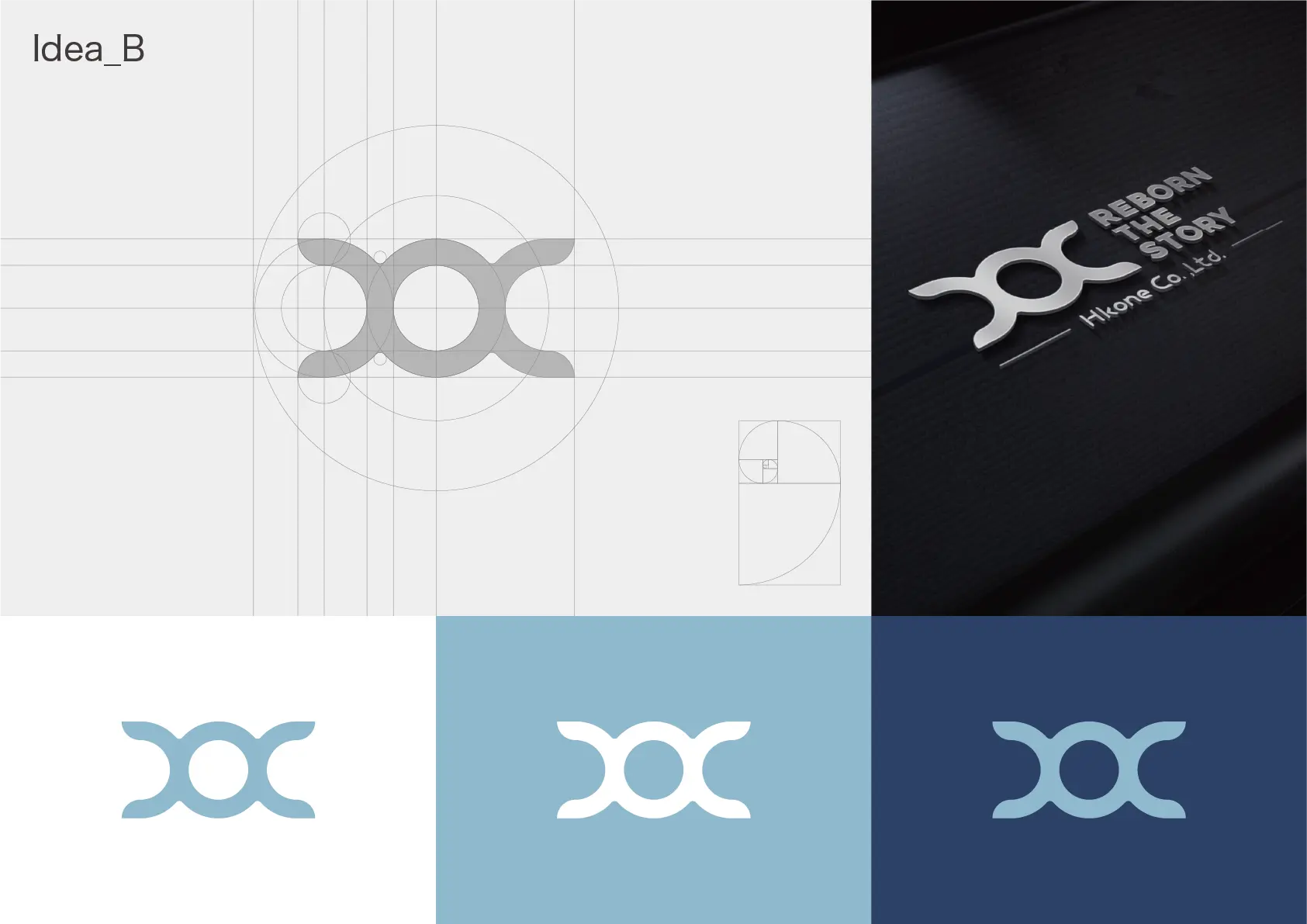
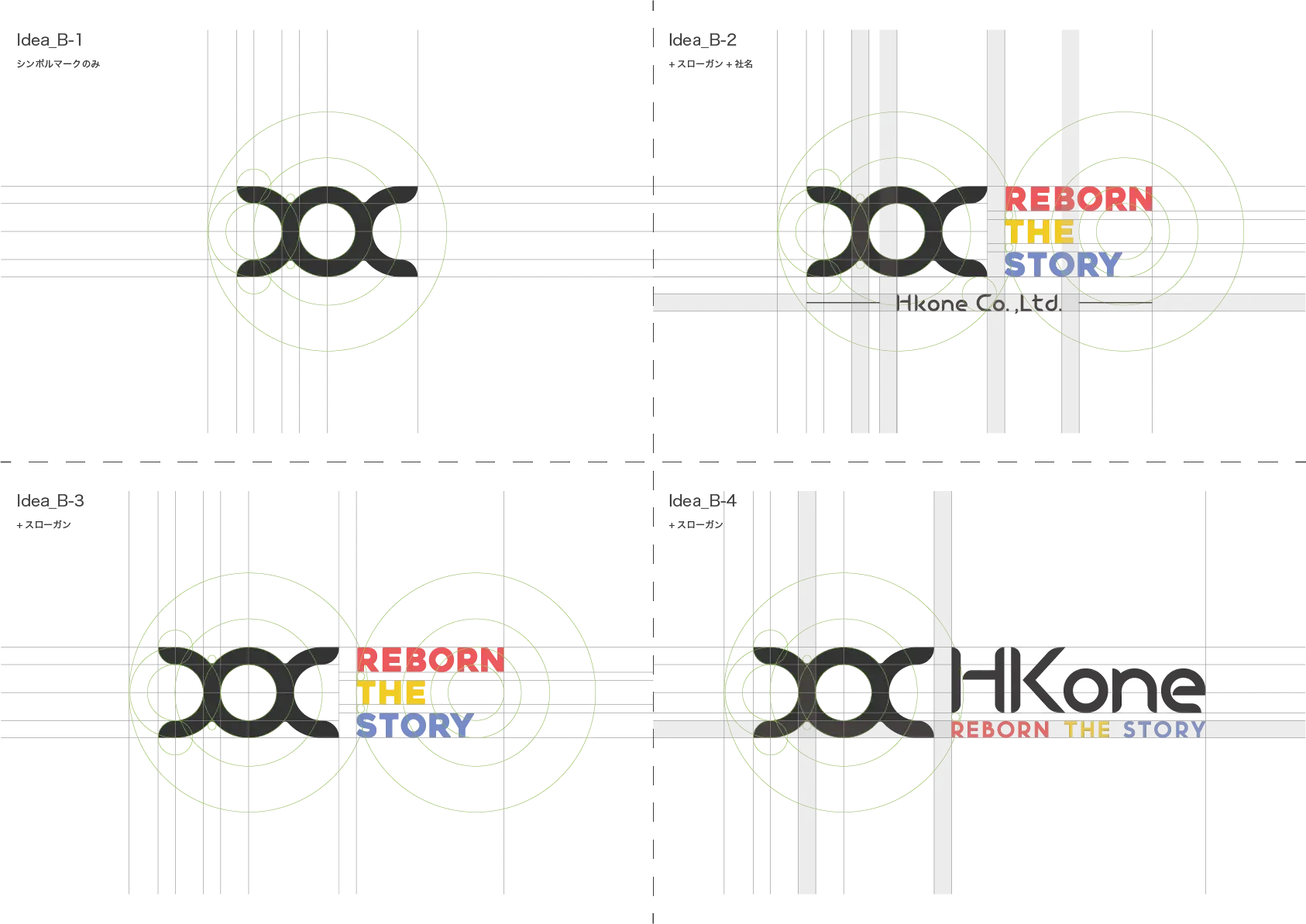
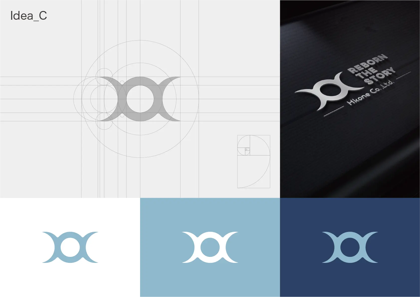
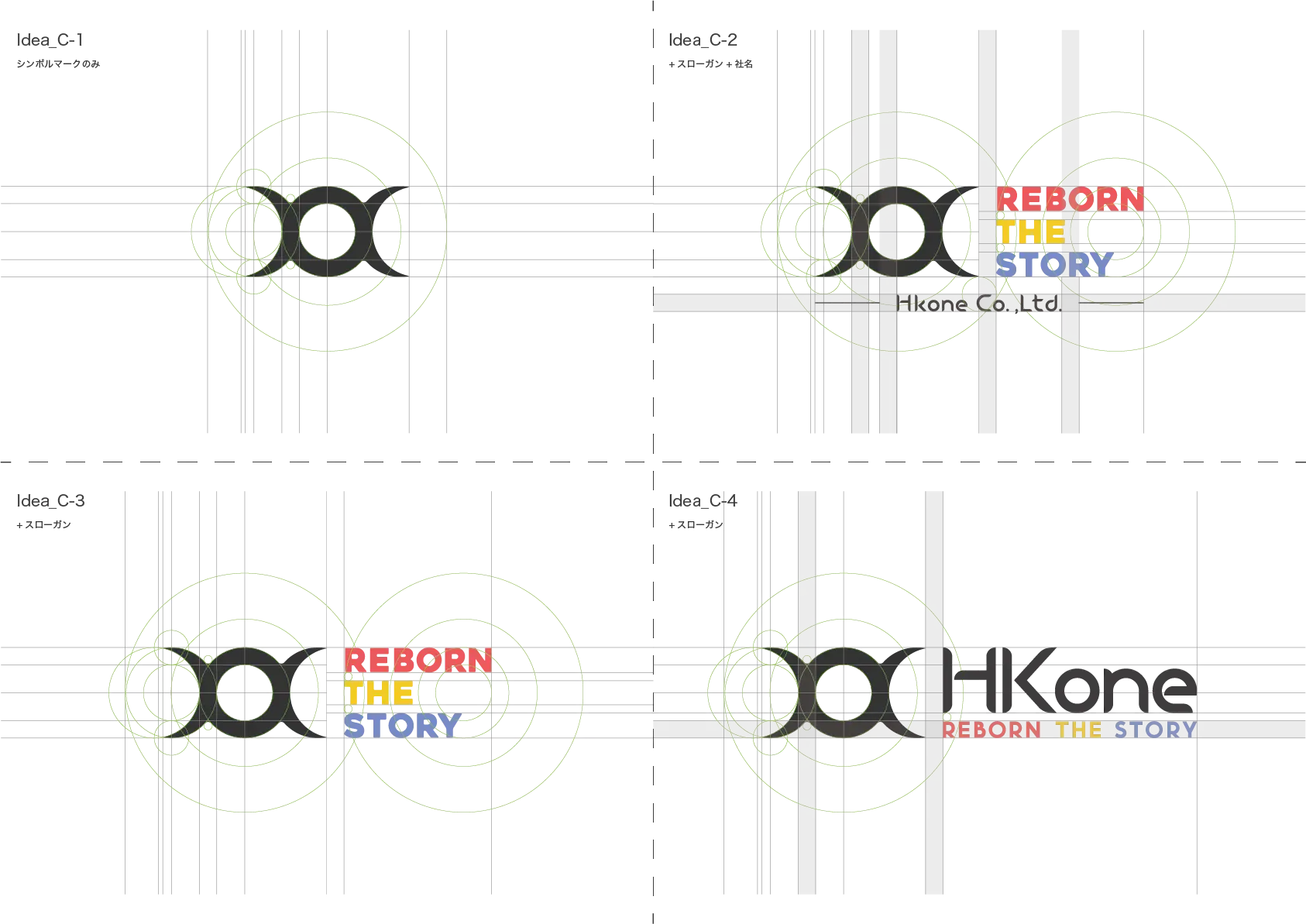
The client requested that I redesign their old logo by incorporating the “Golden Ratio.” To do this, I used Fibonacci circles as a guide to create a new logo, carefully adjusting the proportions to ensure a balanced and harmonious design.
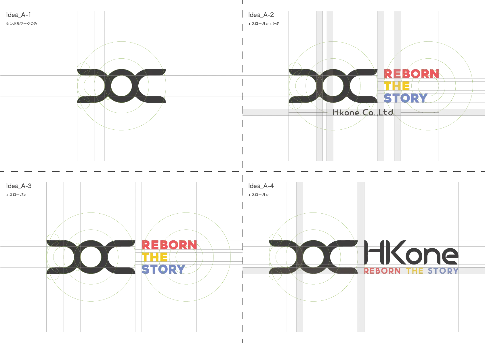
For the text “REBORN THE STORY,” the client wanted each line to have a different color, but they didn’t specify any particular colors. Therefore, I suggested a color scheme based on color psychology, aiming to reflect the company’s values and services.
I took inspiration from the primary colors of paint that are essential to their work, namely cyan, magenta, and yellow. Then, I chose the “psychological primary colors” of red, yellow, and blue. These colors are often associated with clear emotions and strong will, which I believed would effectively represent their reliability and confidence in their expertise.
I also created variations for using just the symbol mark or for simpler designs with fewer colors. For this, I used their “lucky colors” which are black, blue, and silver, and added a slightly grayish tone to the blue to emphasize professionalism, high quality, and the company’s strength in waterproofing and painting.
By combining color psychology with the Golden Ratio, I created a logo that communicates HCH ONE’s expertise, reliability, and their potential for future growth.
Artwork
- DATE
- 2022
- CLIENT
- HK ONE Co., Ltd.
- URL
- -
- TAGS
- Graphic Design
